"THE RIVER IS MY TIME MACHINE."
That is how Jon described his feelings for the river when he approached me about developing the brand for his guided river tour company. The Hiwassee river and East Tennessee are rich with many exciting opportunities for the seasoned outdoor enthusiast and novice alike. The goal was to create a brand that would set Jon apart from the many touring adventures already in the area and reflect his personality and unique perspective.
NAME & LOGO IDEATION
In contrast to the wild rapids of the nearby Ocoee, the Hiwasee river lends itself to a more laid back experience. The need to get away. The comfort of stepping back in time. The sound of the water sliding over the rocks. The laughter and excitement of guests as they experience the river for the first time, or any time. An osprey or eagle calling as they soar overhead and the anticipation of discovering something new each time. These were the elements Jon wanted his brand to communicate. It made sense considering Jon himself is a laid back soul. When he first reached out to me, he described his business as a float service. As a part of the discovery process Jon took me down the river for a first hand experience of him and his river tour. This is when the word "float" began to have a resonance and we determined that Jon's last name, Martin and the word float were a perfect, fit describing how his guests would experience Jon and the river.
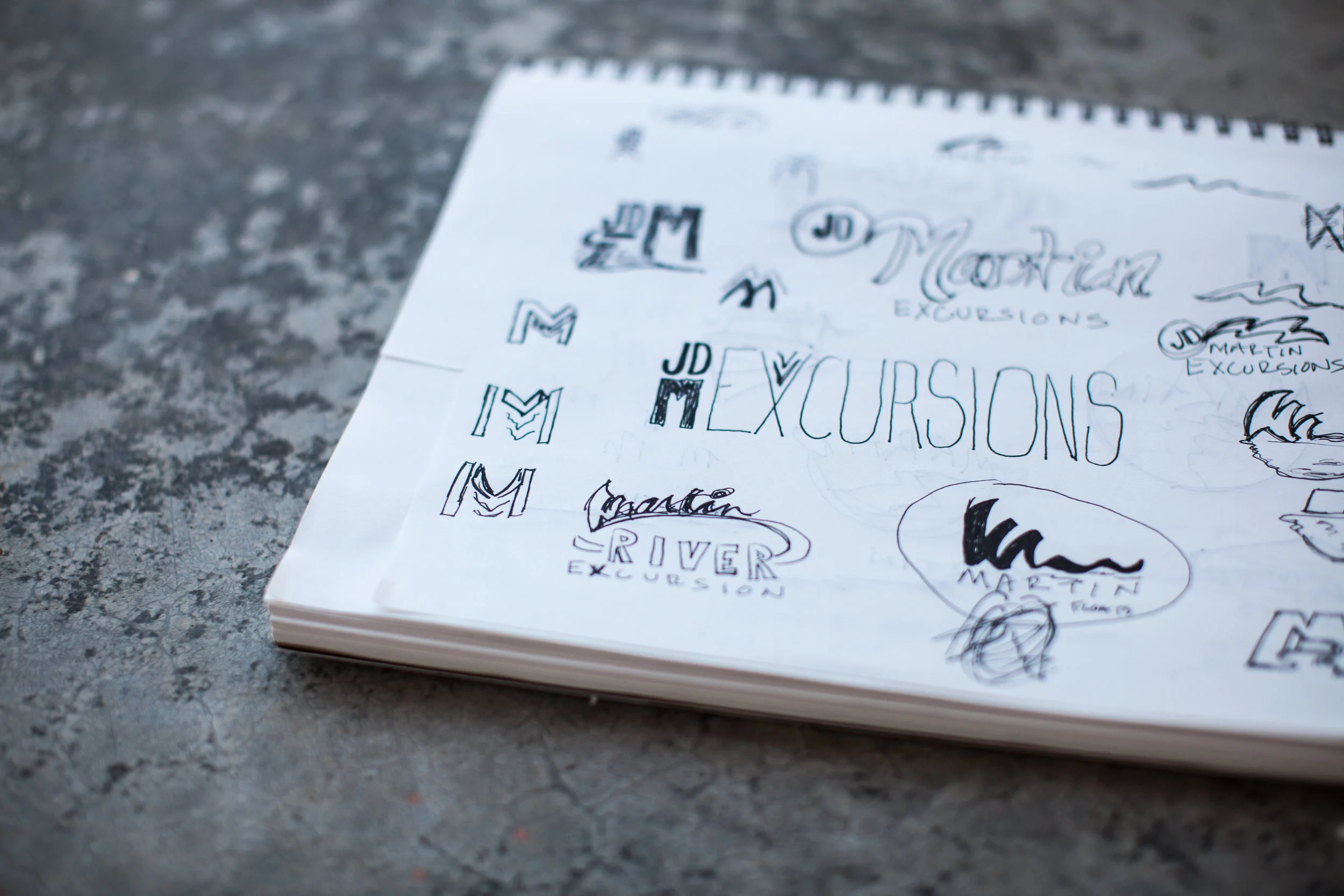
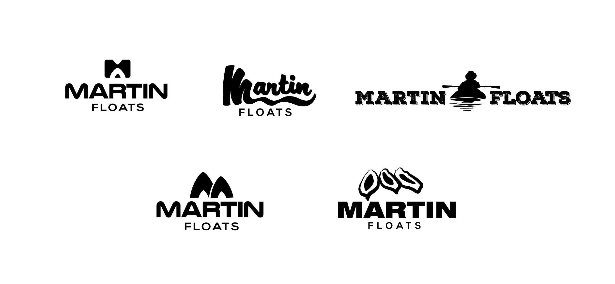
With the perfect name in place I began some logo concepts (as seen below). For the final iteration, Jon settled on the more rounded, informal sans serif letter forms for the logotype and I developed a brandmark that simply conveys the letter "m" using the shape of the bow and stern of a kayak illustrating what a guest would see as they following Jon down the river.
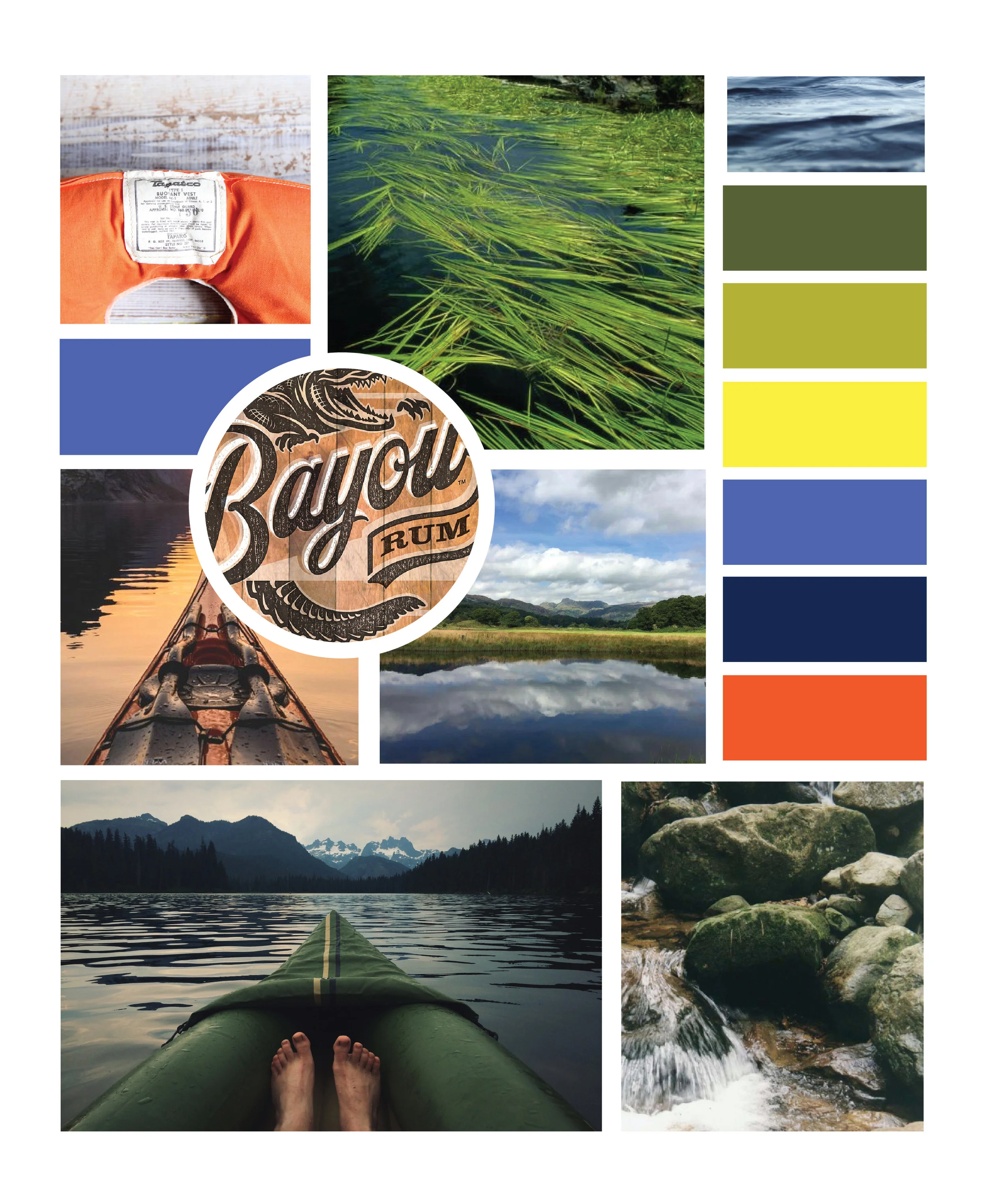
INSPIRATION BOARD & COLOR PALETTE

