
MARTIN FLOATS
MARTIN FLOATS
"THE RIVER IS MY TIME MACHINE."
That is how Jon described his feelings for the river when he approached me about developing the brand for his guided river tour company. The Hiwassee river and East Tennessee are rich with many exciting opportunities for the seasoned outdoor enthusiast and novice alike. The goal was to create a brand that would set Jon apart from the many touring adventures already in the area and reflect his personality and unique perspective.
NAME & LOGO IDEATION
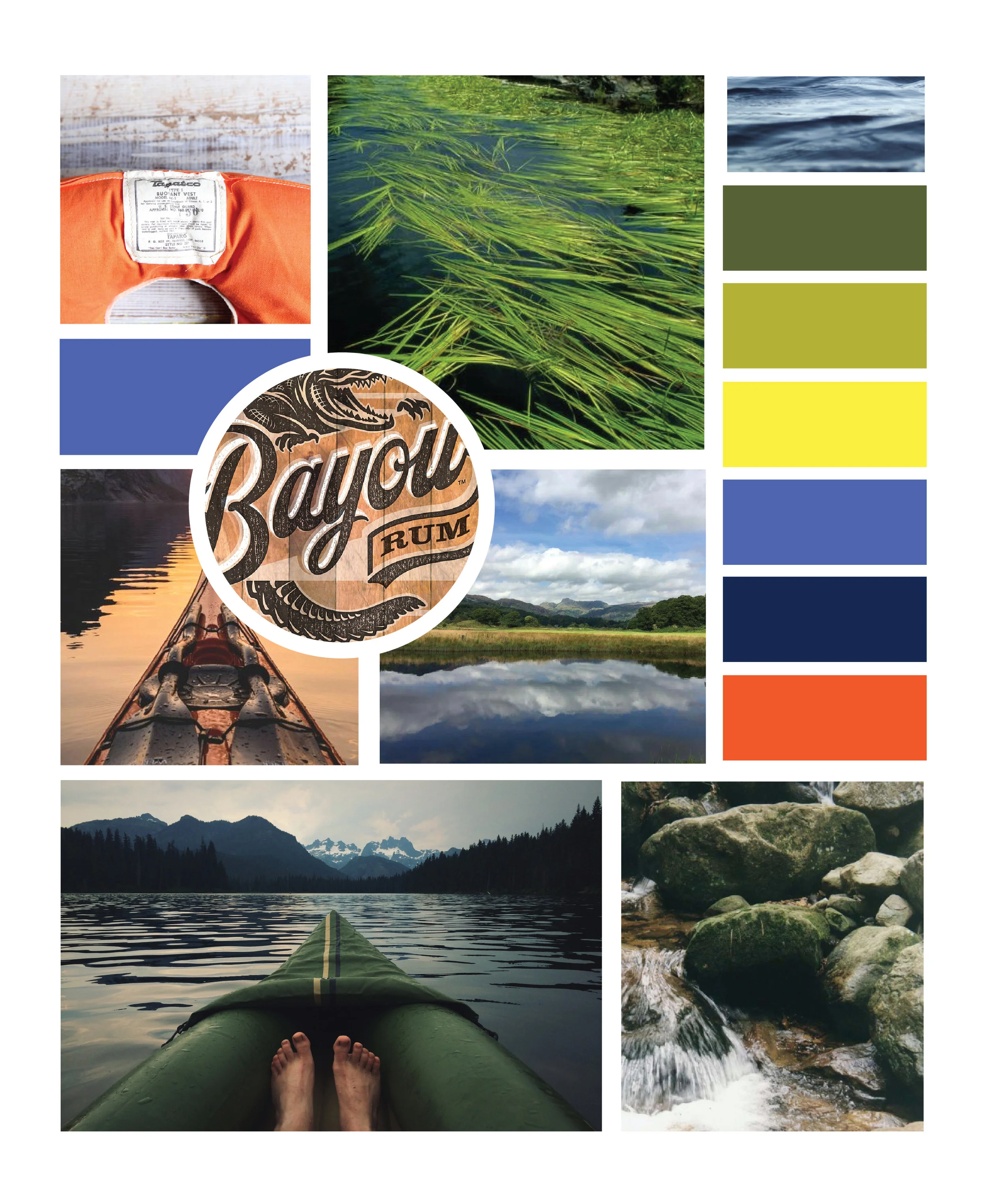
In contrast to the wild rapids of the nearby Ocoee, the Hiwasee river lends itself to a more laid back experience. The need to get away. The comfort of stepping back in time. The sound of the water sliding over the rocks. The laughter and excitement of guests as they experience the river for the first time, or any time. An osprey or eagle calling as they soar overhead and the anticipation of discovering something new each time. These were the elements Jon wanted his brand to communicate. It made sense considering Jon himself is a laid back soul. When he first reached out to me, he described his business as a float service. As a part of the discovery process Jon took me down the river for a first hand experience of him and his river tour. This is when the word "float" began to have a resonance and we determined that Jon's last name, Martin and the word float were a perfect, fit describing how his guests would experience Jon and the river.
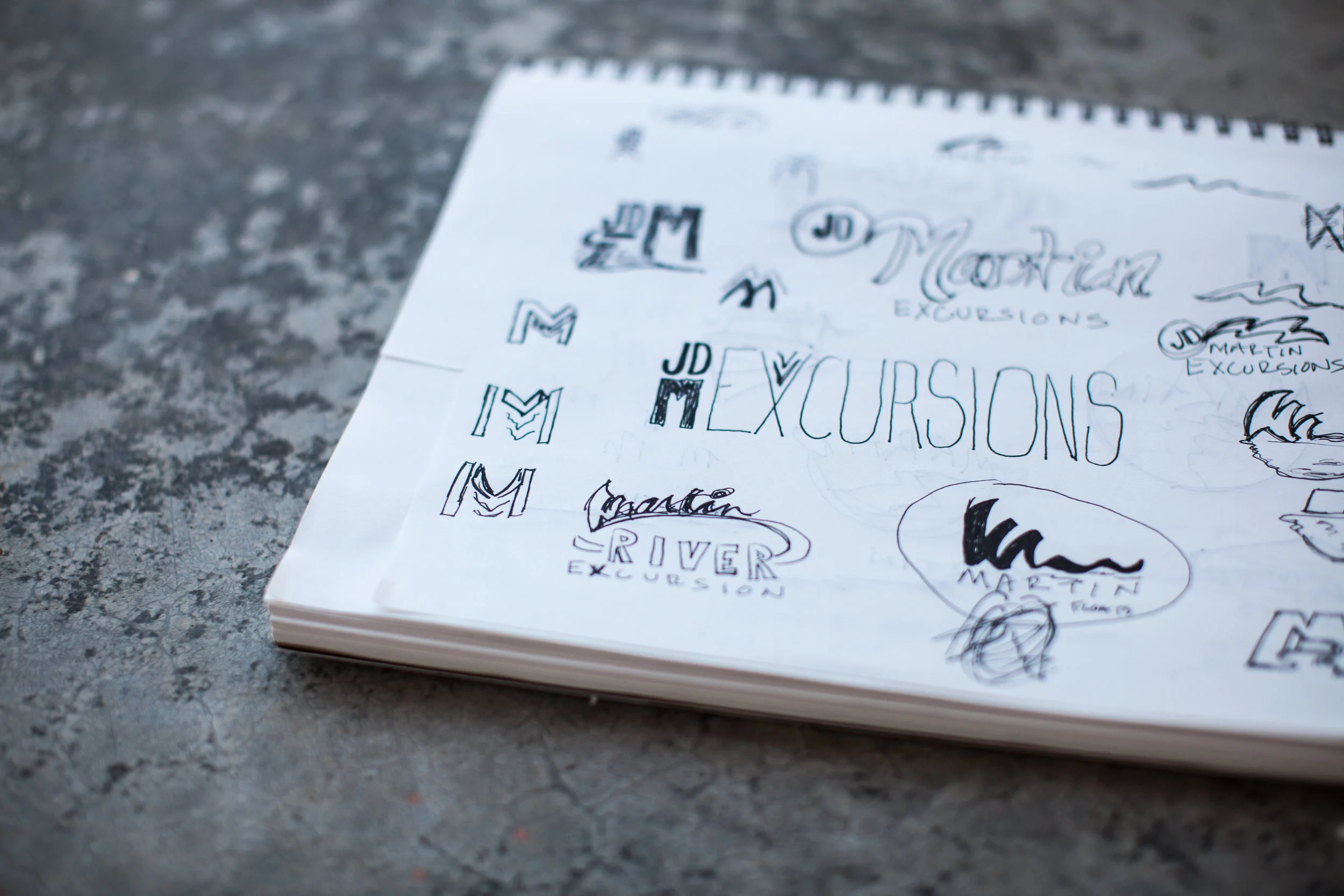
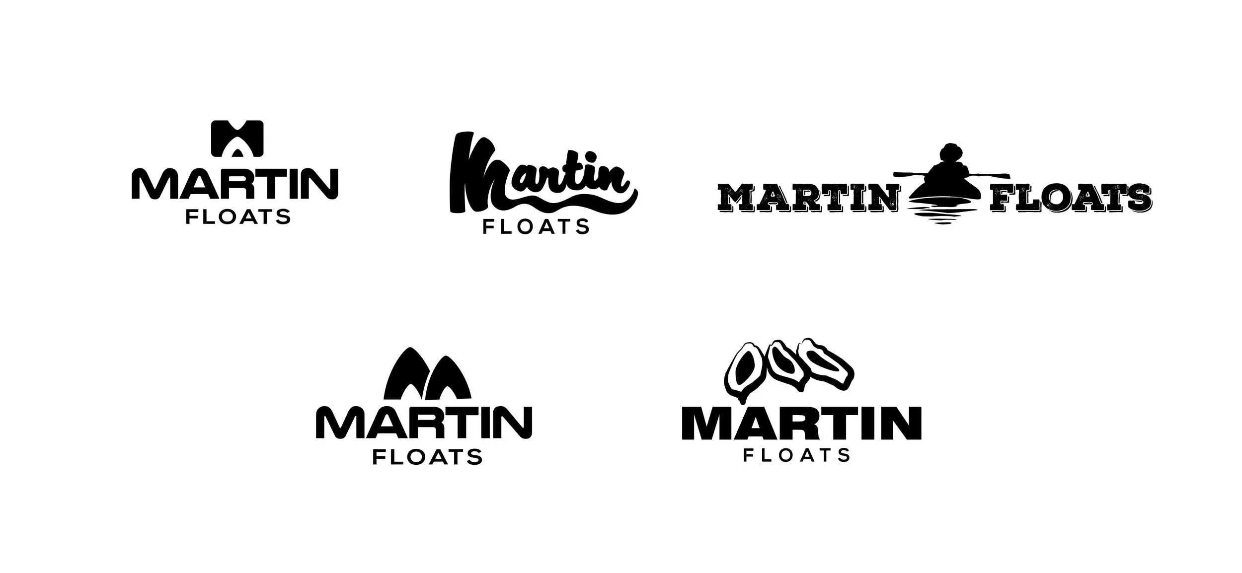
With the perfect name in place I began some logo concepts (as seen below). For the final iteration, Jon settled on the more rounded, informal sans serif letter forms for the logotype and I developed a brandmark that simply conveys the letter "m" using the shape of the bow and stern of a kayak illustrating what a guest would see as they following Jon down the river.
INSPIRATION BOARD & COLOR PALETTE
HOONEW
HOONEW
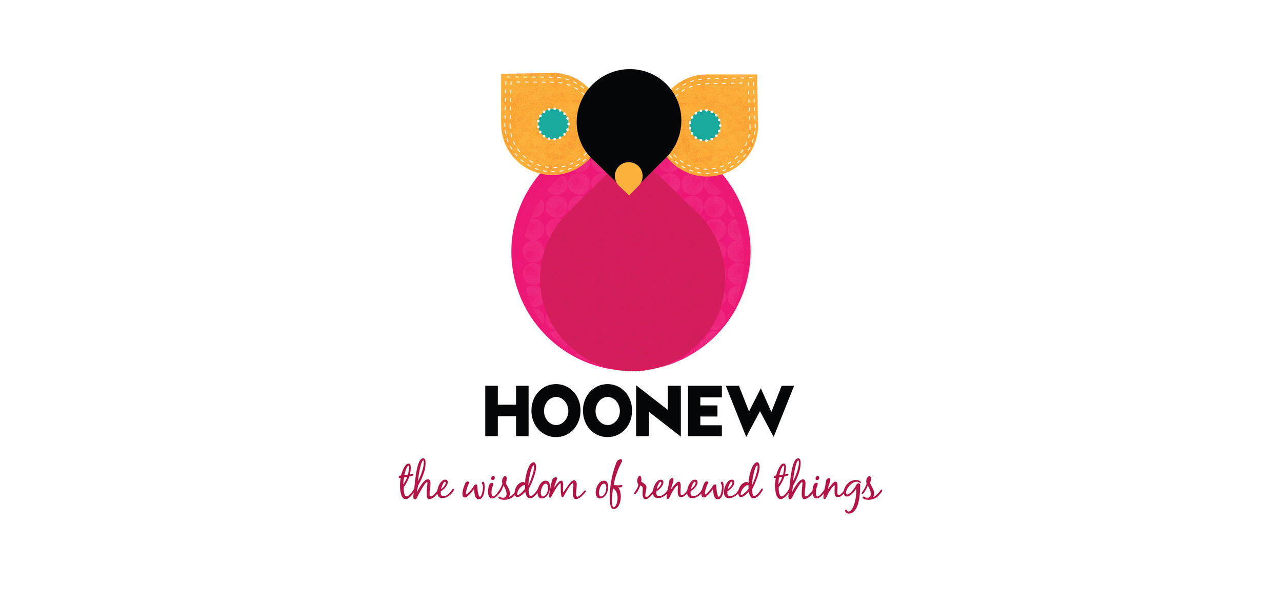
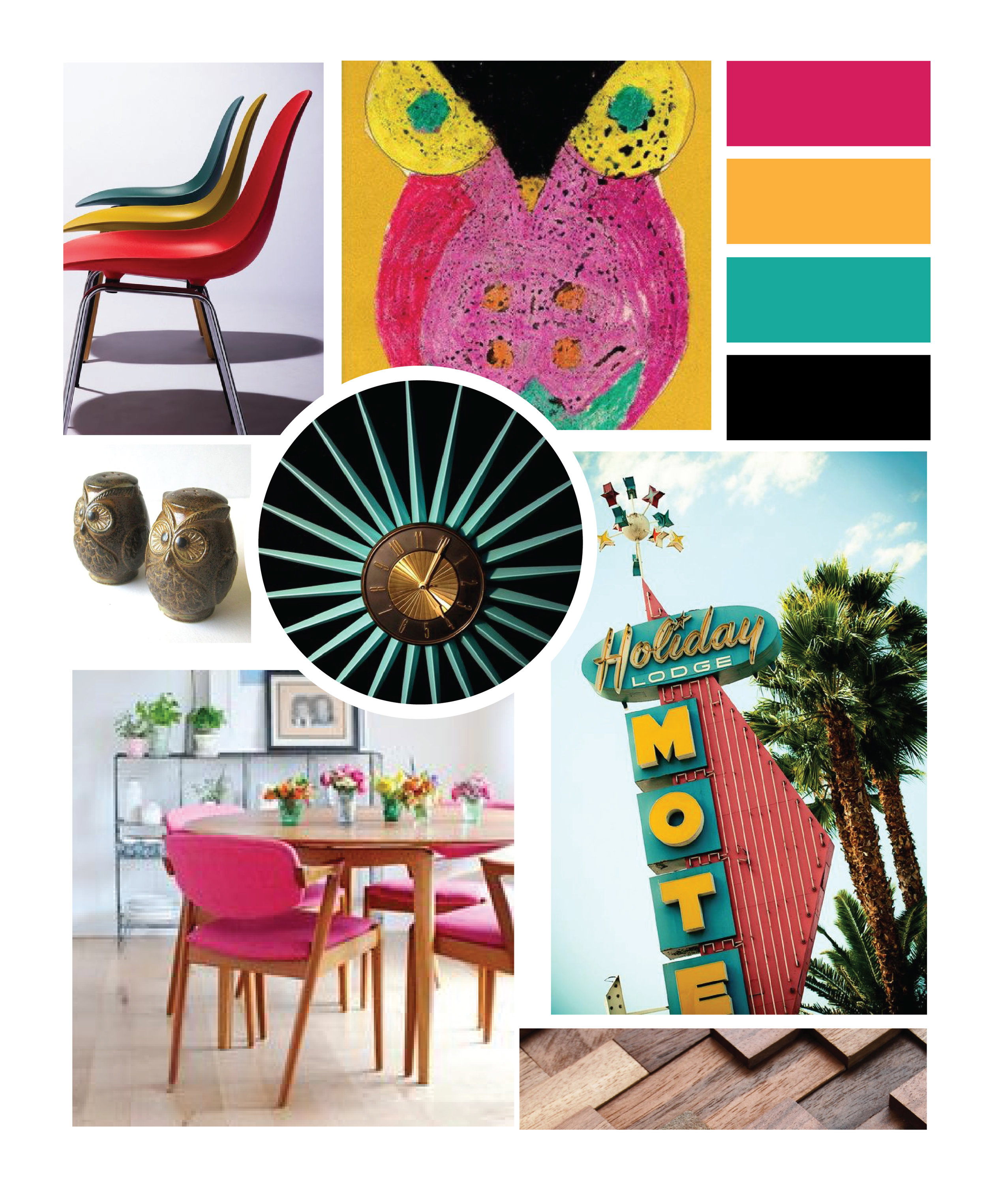
"Who knew!"she said. "That's what people would say to me when I would show them an old sweater that I had repurposed into a pair of gloves or a mid-century television cabinet that I transformed into a wet bar." I listened as Evelyn shared how the exclamation "Who knew!" and an elementary school drawing of an owl by her daughter inspired her business name and it was perfect. With her small business well underway and a solid, creative name full of meaning, Evelyn was ready to bring a level of sophistication to her upcycle business yet still convey the personal, handmade feel that is at the heart of her brand.
Using inspiration from mid-century typography and illustration, I transformed the actual scanned version of Evelyn's daughter's owl drawing into a more stylized, streamlined vector illustration that Evelyn could easily use on collateral pieces like hang tags, point of sell tags, business cards and more. We scripted and shot her brand story video on location in her workshop and at both of her store locations. After hearing Evelyn's brand story numerous times during the shooting and production of her brand story video, the tagline was born in my mind. The video would be a first-hand look at Evelyn's creativity and highlight a special customer story that illustrates just what upcycled goods would mean to her future customers.
LOGO VARIATIONS

INSPIRATION BOARD & COLOR PALETTE
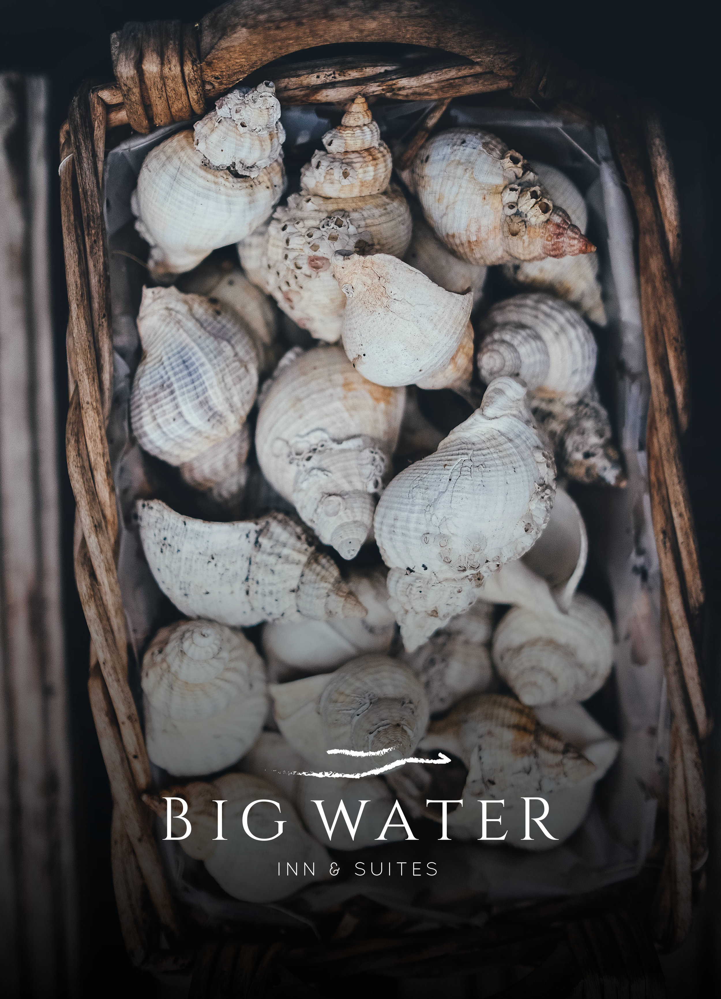
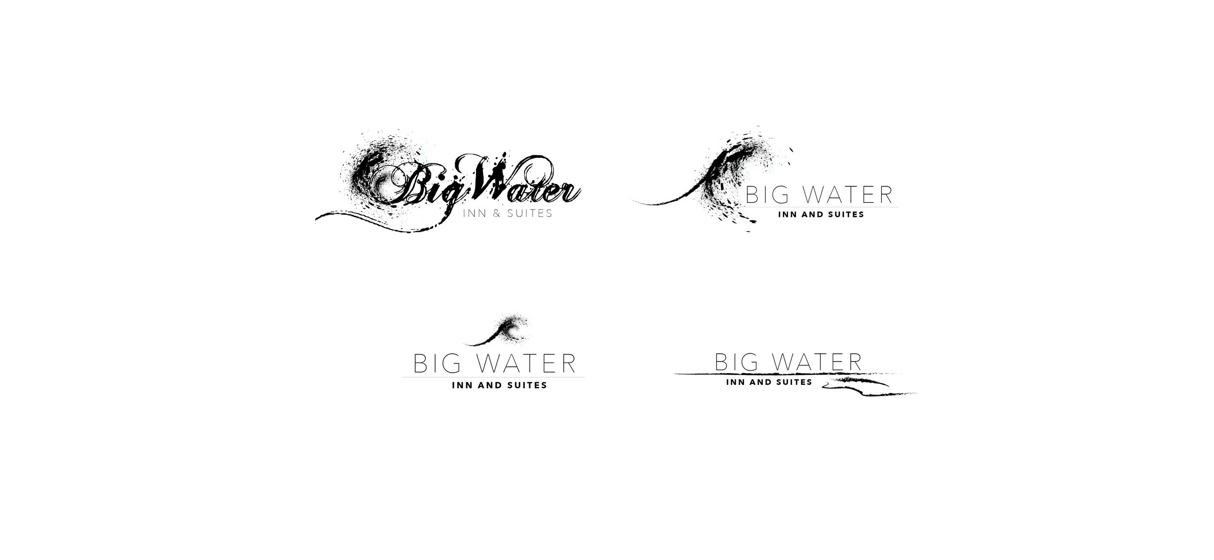
BIG WATER INN & SUITES
BIG WATER INN & SUITES


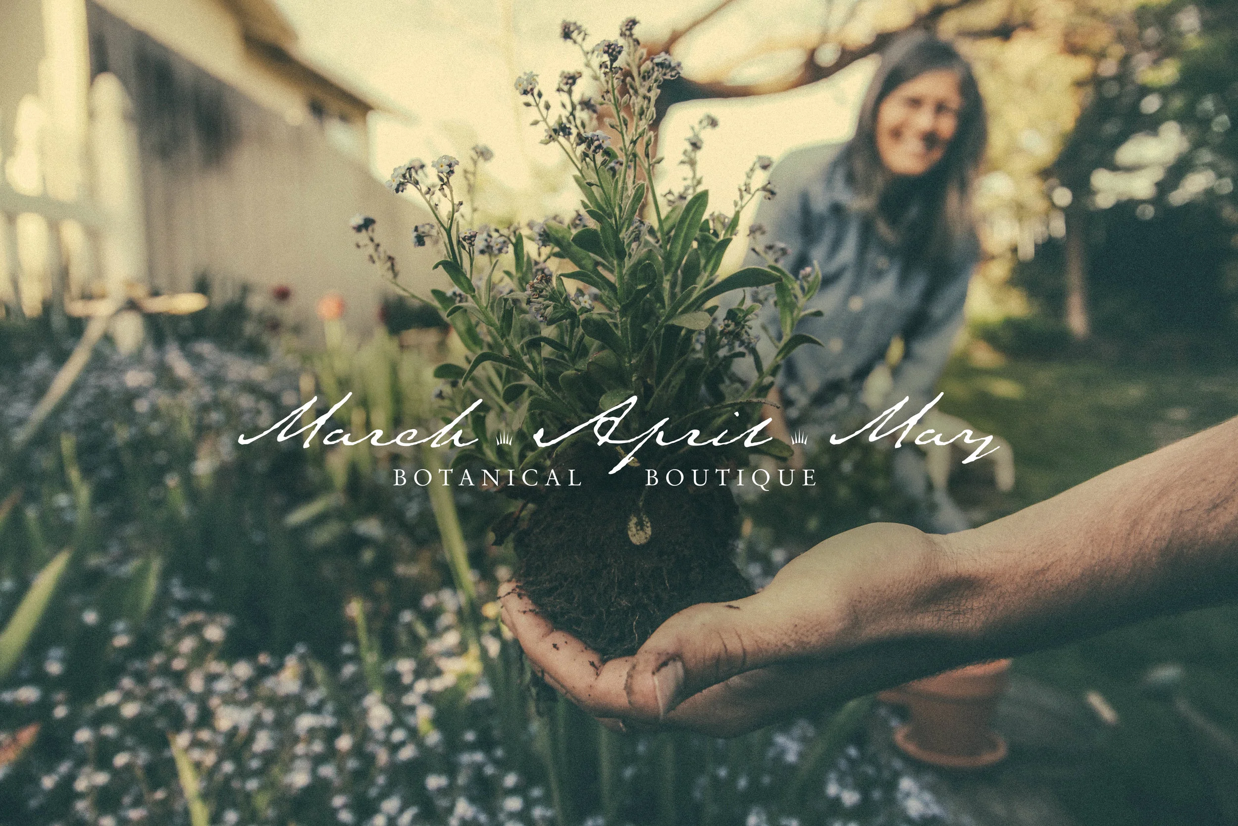
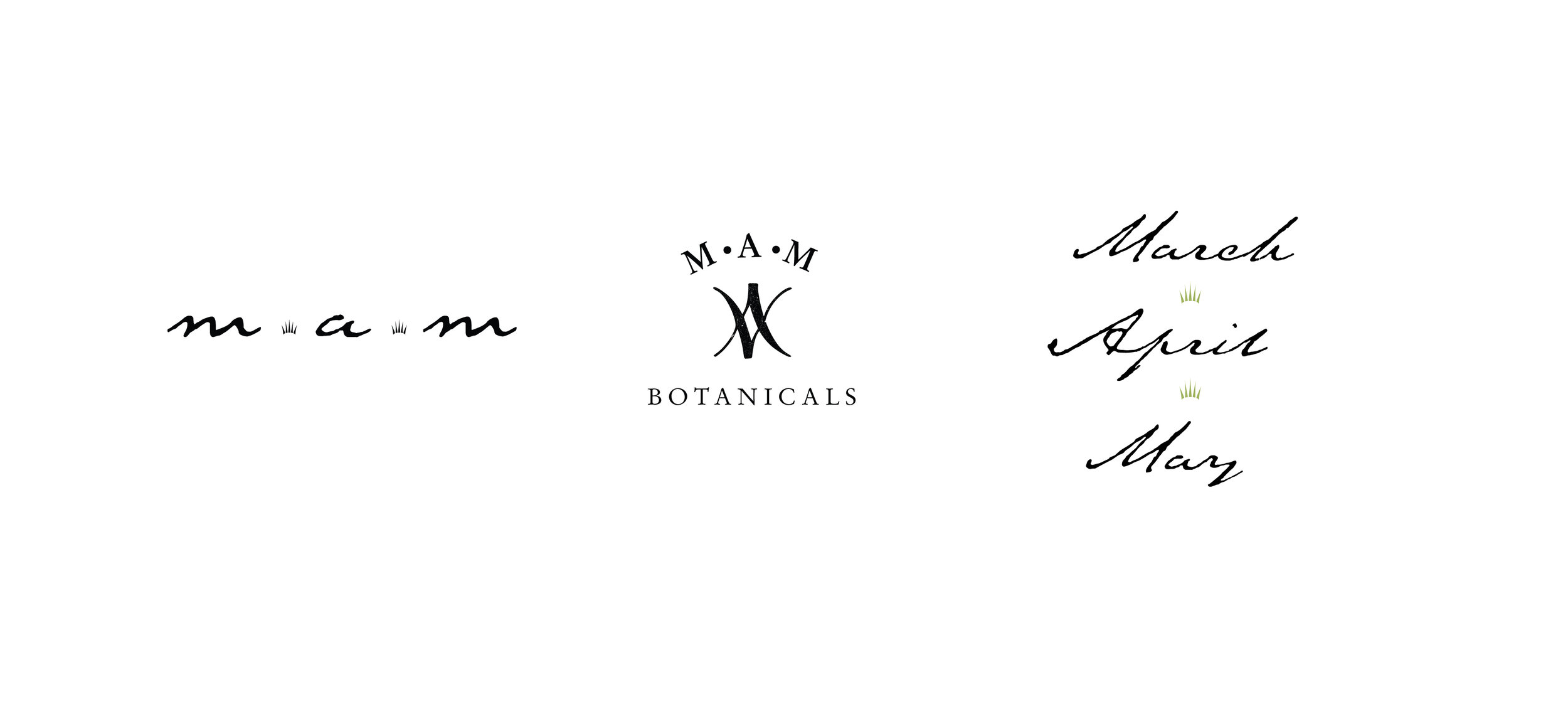
MARCH • APRIL • MAY
MARCH • APRIL • MAY


March April May is a botanical boutique concept celebrating the prodigality of Spring and the magic of seeds bearing fruit from the dark, moist earth.
Projects always begin with the very organic process of putting pen to paper, whether or not the concepts evolve past the original once they move to the computer. I knew that this botanical boutique concept, inspired by the spice shop in the late nineties film Practical Magic needed to feel as natural and subtle as possible. A simple set of icons were developed and used along with a script that has elegant letter forms and a visual presentation of ink bleeding into a sophisticated, hand-made paper. The all-caps serif font used for the descriptor adds contrast and the timeless look of quality.

LAVA JAVA COFFEE
LAVA JAVA COFFEE
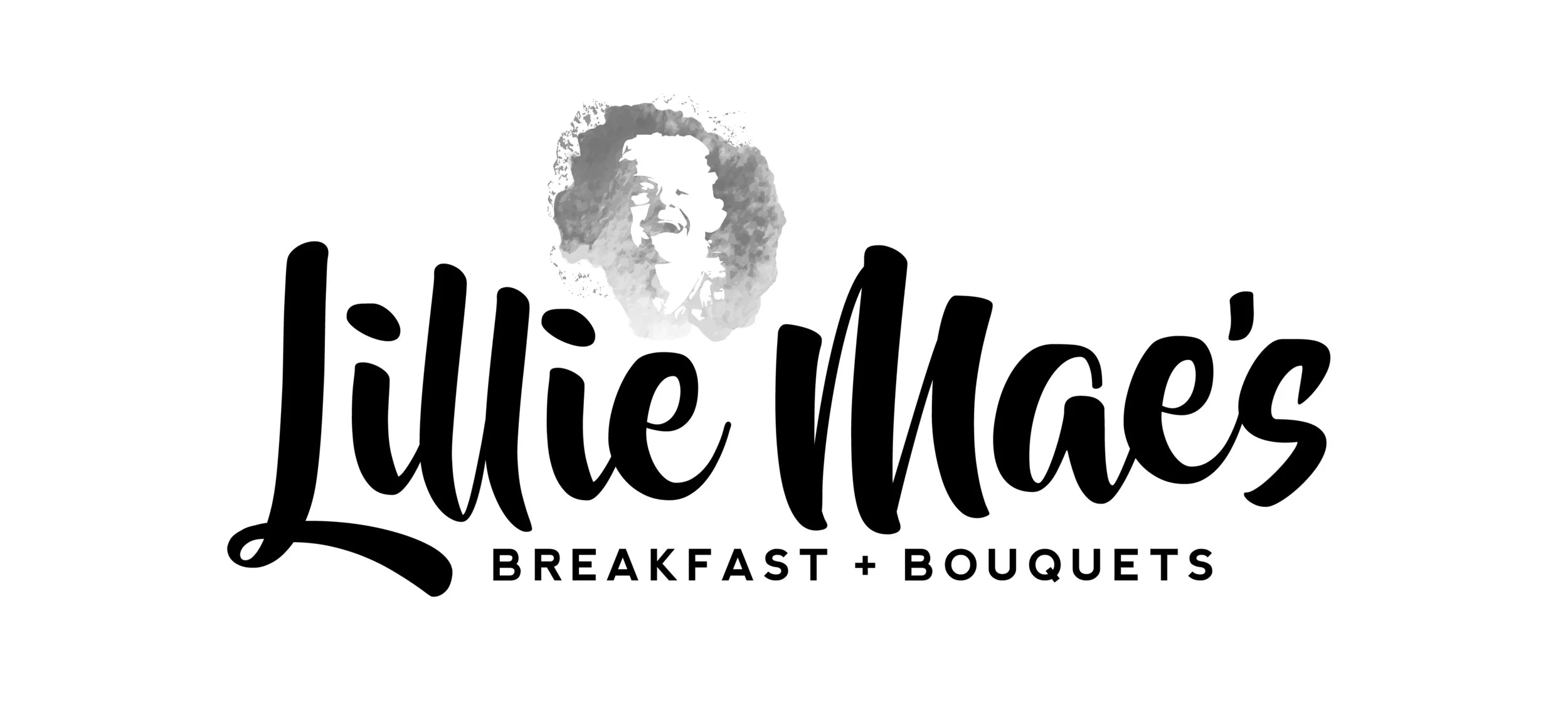
LILLIE MAE'S
LILLIE MAE'S
HOLLINGWORTH CANDIES // REBRAND
HOLLINGWORTH CANDIES // REBRAND
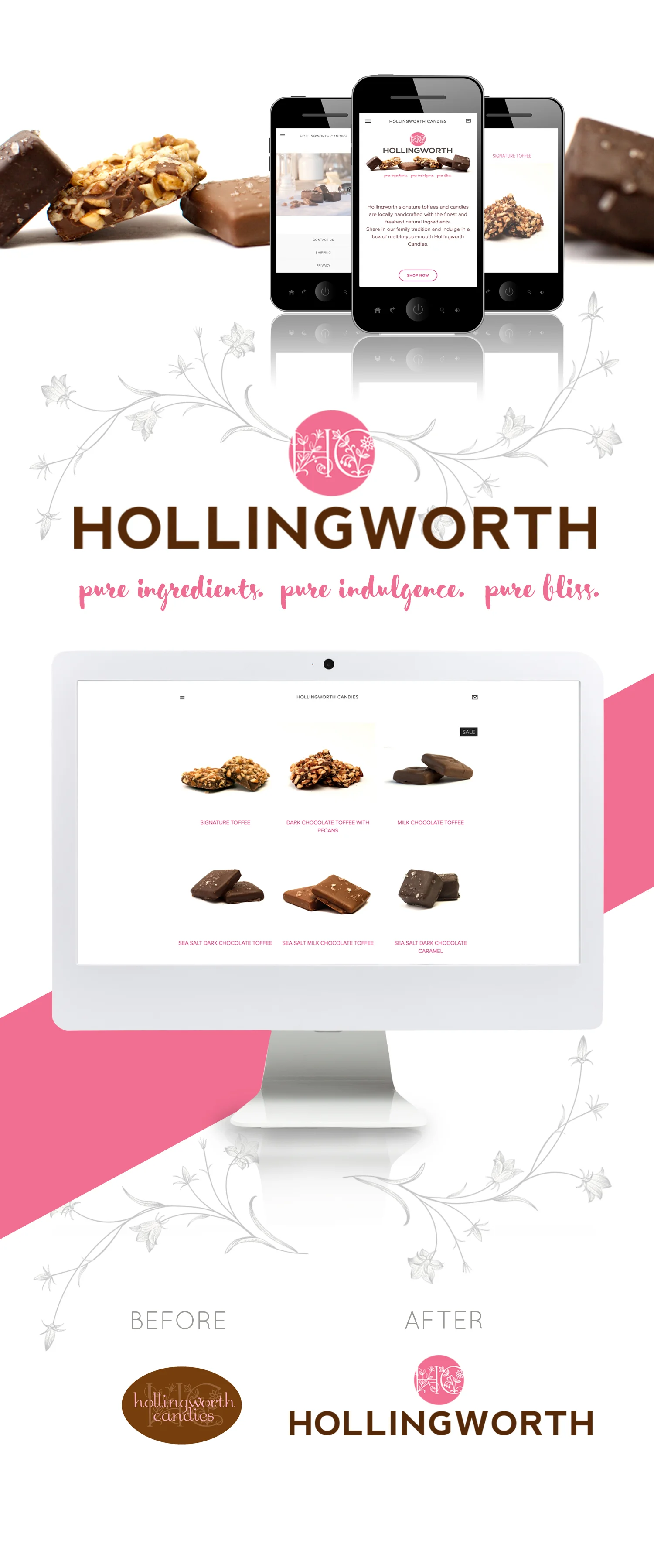
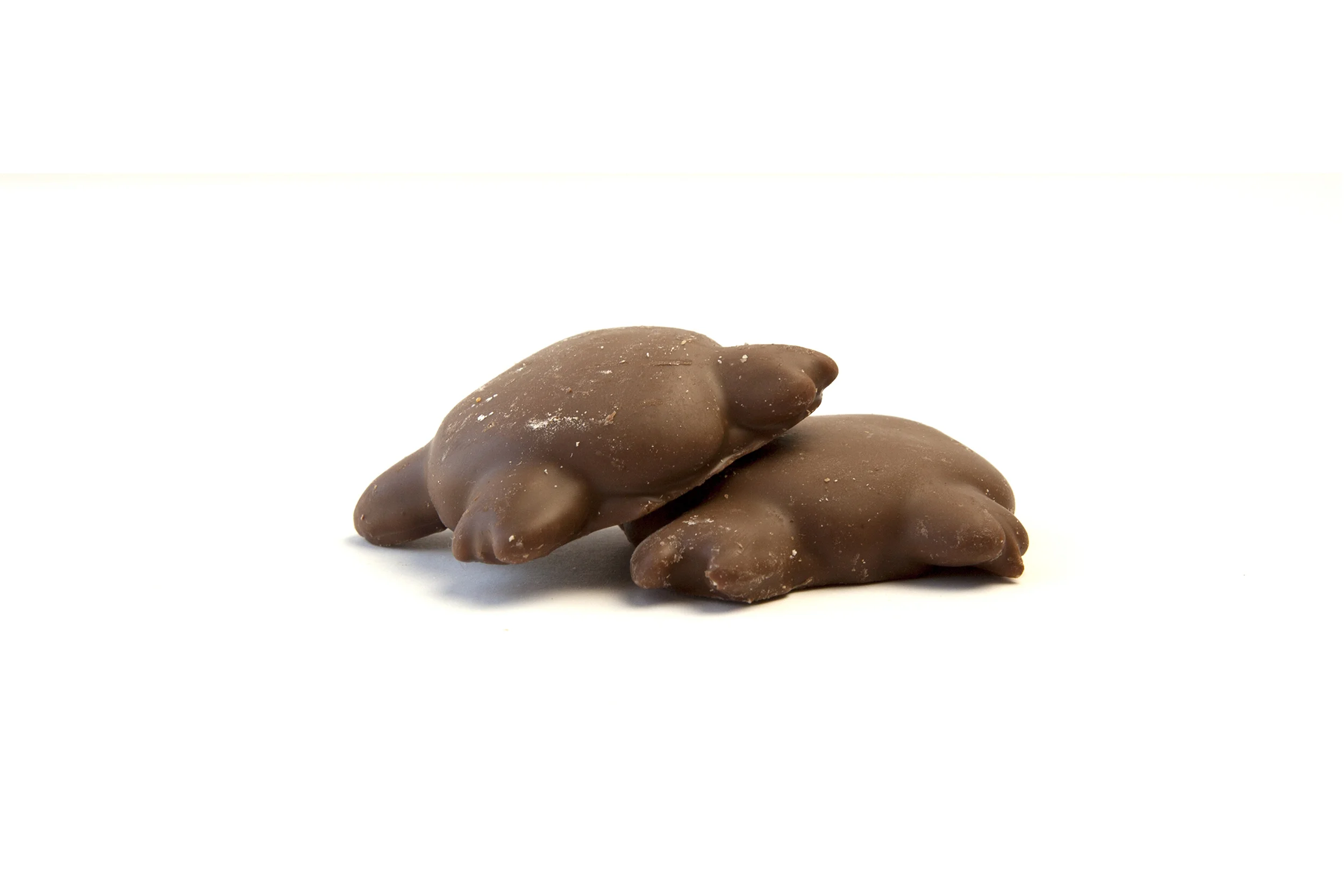
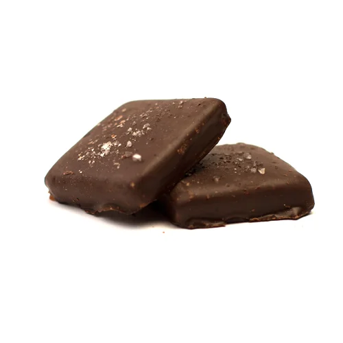
PRODUCT IMAGES AND HERO SHOTS